Should Your Interface have a Dark Mode?
Feb 23rd, 2019


Share
PROS
1. Easier on the Eyes

Via: Viviane Gulacsy
We’ve all encountered the experience of having to open up a screen at night only to be blinded by light emitted from the interface. But with the dark mode, light emission from the screen is reduced and users have a more pleasant experience in darker environments.
Reddit user illusionmist simply summarizes this by experience with:
“Night is dark. Screen is bright. Eyes hurt.
Night is dark. Screen is dark. Eyes not hurt.”
2. Focuses Content

Since the introduction of CS6, Adobe Photoshop has implemented a dark interface over a light interface for good reason.
Dark mode focuses content by reducing visual distractions and accentuating important content on complex interfaces. So for an interface like Photoshop which has several elements, dark mode helps users concentrate on the subject at hand.
This is also why most developers like to code in dark interfaces or dashboards on car tend to have dark backgrounds.
3. Helps Battery Life (sometimes)

Via: Pierre Kleinhouse
Logically, it makes sense that a darker screen would save battery life as it emits less energy. However, contrary to common logic, dark mode currently does not save battery on most devices with LCD screens.
This looks to change, however, with the new introduction of true black on OLED screens such as on the Google Pixel or iPhone X. And we are increasingly seeing a demand for dark interfaces to save battery life.
4. Cooler Aesthetic

Via: Dragon-one
One of the strongest cases for having a dark mode is just simply that it looks cooler and attracts many users.
Dark interfaces exude a lot of messages such as elegance, prestige, mystery, or luxury. It’s no wonder that several brands from car to watch companies like to utilize that to their advantage.
With the introduction of the new Mac OS Mojave and MIUI 10, dark mode is increasingly becoming an option in interface design. It’s cool. It’s new. It’s chic. But is it worth investing the resources to create it?
Here we will explore the pros and cons to dark mode and help you decide whether or not implementing dark mode would be a valuable option for your interface.
CONS
1. Worse Readability
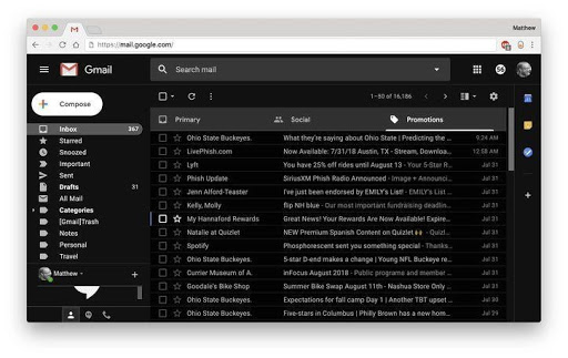
Via: Matt Elliet/CNET
Though dark mode can focus content, it can also significantly decrease readability when there are a lot of elements such as text.
In a study conducted by Bauer and Cavonius, they found that visual fatigue was significantly greater when people read bright characters on a dark background over dark characters on a light background.
So, it is better for websites with lots of textual elements such as blogs or news sites tend to use light themes over dark themes.
2. Restricts Color Palette

Via: Alexander Zaytsev
Another downside to having a dark interface is that it typically restricts the color palette that designers can work with.
Dark interfaces typically need brighter colors to stand out against the background and as a result, multi-colored media also tend to look better against light interfaces.
3. Might not Align with Existing Branding

Via: Alexander Zaytsev
Going along with having a restricted color palette, having a new dark interface may not align with your product’s existing branding
Especially when your platform has a variety of different elements, having to switch to a new color scheme may not fit with your existing features and create inconsistencies within the platform.
4. Doubles Workload

Via: James Rotanson
Despite all the pros to dark mode, the one factor you cannot dismiss when thinking about implementing one is that it will double the work for your designers and developers.
To create a new dark mode, there will have to be a significant amount of resources invested to create a new visual design. Therefore, it is wise to consider whether or not a new dark interface is really worth it.
HOW TO DECIDE
Who are your users?

Via: MUTI
Knowing who your users are a basic fundamental for designing good user experience and the same goes here for when deciding to implement a dark interface.
Are they young and desire the newest chic interface? Or are they older and prefer the traditional light paper-like interface?
How is your platform used?

Via: Julia Jakubiak
Another important factor is knowing how your users interact with your product.
Do your users casually scroll through your content during the day time? Or do they need a dark interface to complement the environment when watching movies or playing games at night?
What type of content is on your platform?

Via: Dennis Cortés
As mentioned earlier, dark mode tends to decrease readability so it is highly advised to stay away from it if your platform has a lot of textual elements such as blogs or news.
However, dark mode works really well for platforms with simple content or focused photo and video media, such as seen on platforms such as Netflix.
OVERALL
There are a lot of pros and cons to having a dark mode and it is important to carefully weigh the decision to implement one. However, if you have the time and resources, it wouldn’t hurt to follow this new trend that may attract prospective users to you.

Soomin Kim
Intern at Userfacet
Undergoing Major in Information with a concentration in User Experience Design at University of Michigan, Ann Arbor
Advanced UX Tips
Get actionable tips on user experience designs, delivered straight to your inbox.