Advanced UX Hub

The most practical UX tips learned from decades of experience.
Most Popular
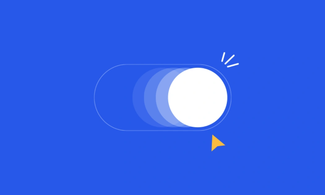
Best Microinteractions practices
Microinteractions are the small animations designed to provide...
Micro Interactions
Read More

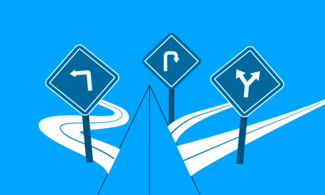
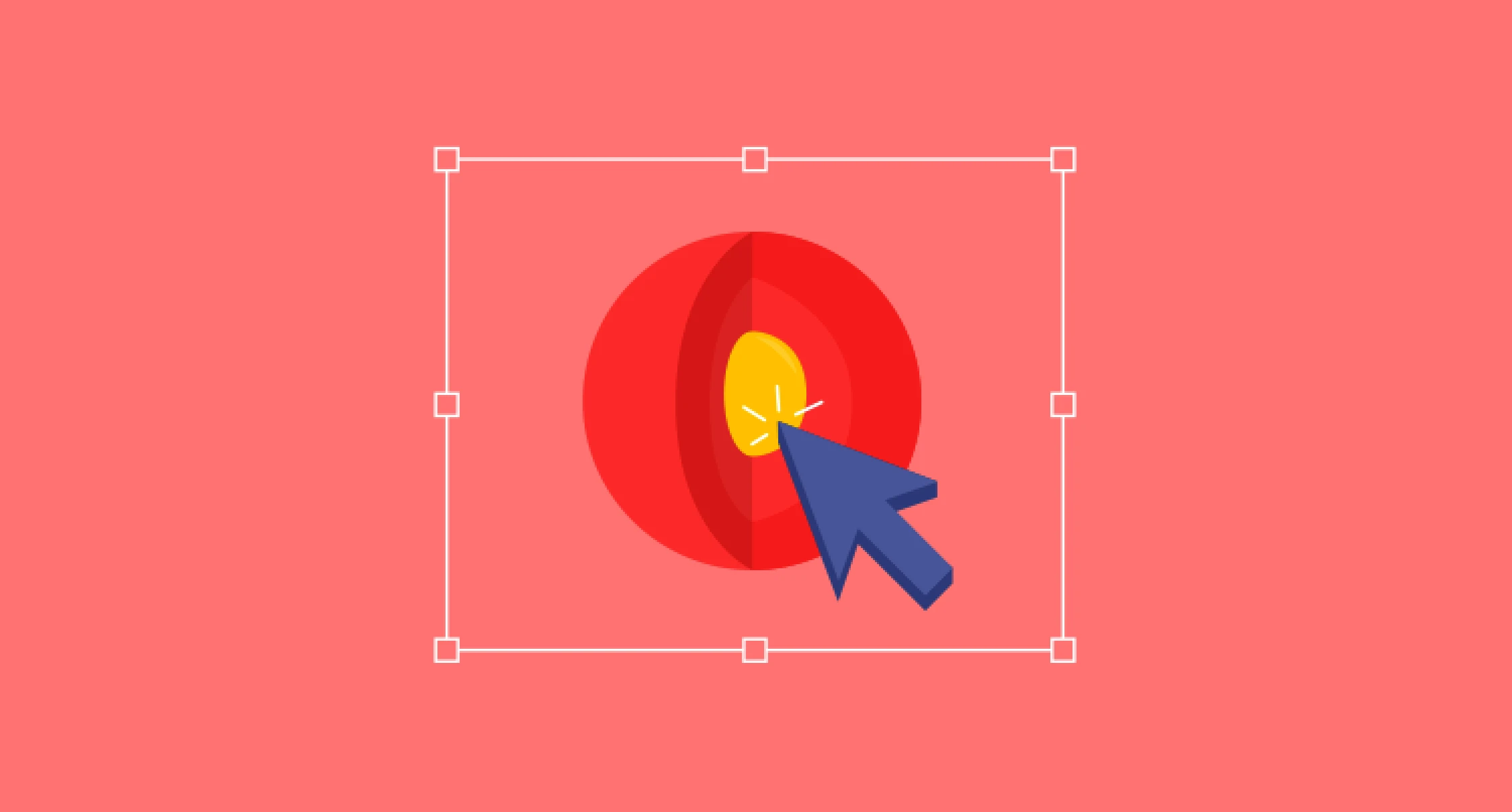
Identify products weakest link
In every system, there is a weak link that disrupts the system/user...
User Research
Core UX
Read More
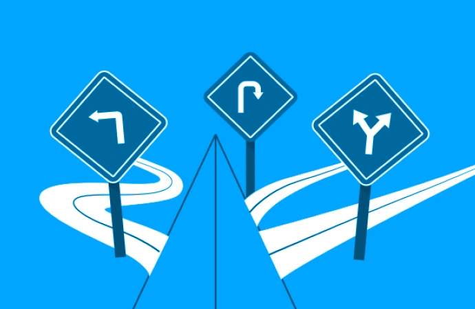
Mark destinations clearly in a user flow
Take effort to make the users feel like they have reached the...
Core UX
Read More
Best Microinteractions practices
Microinteractions are the small animations designed to provide information and instant feedback to the user.
Micro Interactions
Best Microinteractions practices
Microinteractions are the small animations designed to provide information and instant feedback to the user. They are ideal for interacting with the user especially since the resultant feedback has a touch of delight and humaneness.
Microinteractions occur in two ways:
When a user triggers an action in the form of clicking, tapping, swiping, sliding etc.
Informal animation due to the collective behaviour of the user's action and not necessarily by a single trigger.
Best practices for using microinteractions:
Prioritise Microinteractions : List all the possibilities where you can include microinteractions in your project which would provide instant feedback or information. Then prioritise them based on the order of “most critical†to “Nice, but not criticalâ€
Not annoying - Microinteractions shouldn't be annoying for repeat / seasoned users. It's advised to be quick enough so that it doesn't consume much of users time just for the sake of animation
Do not reinvent the wheel : Users are accustomed to a set of behavioural patterns(like “green means go, red means stopâ€). Microinteractions shouldn't change this and define new ones.
Example:
Real time status of the cab moving towards the user is shown on the map. This is in accordance with one of the principles of heuristics, to show the "system status to the user".
On tapping the button named "Micro", the button rotates on its axis and changes the color. This microinteraction re-assures the user that the resultant feedback is due to the action the user performed.
Micro Interactions

Identify product's weakest link
In every system, there is a weak link that disrupts the system/user flow. It is important that you observe, find and design for this weak link.
User Research
Core UX

Identify products weakest link
In every system, there is a weak link that disrupts the system/user flow. It is important that you observe, find and design for this weak link.
Example:
In one of our travel applications, users could click pictures and check into locations while travelling. At times, even when the phone indicated that its connected to the internet, it actually was not connected. Without knowing this, users would be waiting for location results from the server. But due to a bad connection, they wouldnt get any result and it breaks the user flow. To prevent this, we added a check on internet connectivity and if there is no response from the server in 10 seconds, the system moves into offline mode. Users can then seamlessly complete the entire task in offline mode. This boosted the applications engagement tremendously.
Likewise, identify the weakest link in your product and design accordingly to avoid that bad user experience.
User Research
Core UX
Mark destinations clearly in a user flow
Take effort to make the users feel like they have reached the destination or have completed a task flow
Core UX
Mark destinations clearly in a user flow
Take effort to make the users feel like they have reached the destination or have completed a task flow
Even in websites, at the end of a task flow, refrain from making the users feel that there is still more to the flow. Their moment of feeling that the task is accomplished / satisfaction will be lost. Also, when the user is within a flow to complete a task, remove all sorts of distractions. You should not divert/confuse them with multiple options.
Example:
After a user completes a purchase, refrain from showing large, bright buttons in the end because it will not give the user a sense of completion. Instead you could use subtle links to direct them to next destinations from the end screen. Similarly, while the user is in the flow of making an online purchase, remove all navigational elements other than the ones that take them forward or backward in the process to the destination.
Core UX
Use Wabi-Sabi to give products a natural touch
2 Japanese design principles that can help your product feel like its a natural part of users lives
User Research
Core UX

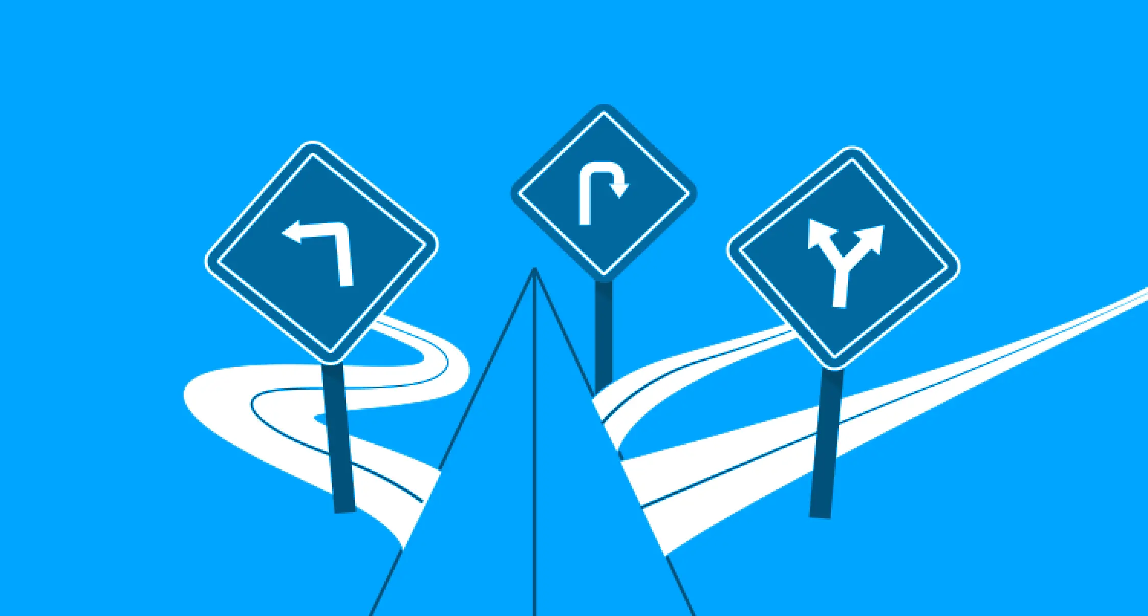
Use Wabi-Sabi to give products a natural touch
2 Japanese design principles that can help your product feel like its a natural part of users lives
Wabi in Japanese relates to aesthetics that look natural or handmade. It also represents imperfection & incompleteness. Sabi denotes to the beauty that comes over a period of time. Borrowing from these concepts, using real photos of nature, places and occasions has been found to be very successful in grabbing users attention. The naturality of the photos make the product seem natural to their lives.
Example:
Pictures of a beach, mountain or even pictures of cultural festivals used in several applications make the product feel like its part of your daily life.
User Research
Core UX

Heisenbergs Uncertainty principle in User research
Drawing inspiration from the famous uncertainty principle in Physics, you can take a more appropriate approach to user research
User Research

Heisenbergs Uncertainty principle in User research
Drawing inspiration from the famous uncertainty principle in Physics, you can take a more appropriate approach to user research
In theory, Uncertainty principle states that the act of measuring sensitive variables can alter them and perplex the accuracy of the results When it comes to user research, it is observed that when you pose direct questions to users, it may result in forced responses. You may instead use ethnography and participatory design methods to find natural responses while conducting user research.
Example:
When youre conducting a user study to get feedback on a new feature in your product, you normally ask direct questions to users. But, this may lead to interference/invasiveness in users thought process and may alter/influence their feedback about the new feature. Hence, the final result may be biased and the goal of user study is not fulfilled. Instead, you can unobtrusively observe the users behavior when theyre using the new feature. This method will not meddle with their thought process and end up giving more accurate and reliable feedback.
User Research
Innovate core experience
Instead of innovating everything in a product, focus on innovating the core experience and use design patterns for rest of the product.
Core UX
Innovate core experience
Instead of innovating everything in a product, focus on innovating the core experience and use design patterns for rest of the product.
User experience design is not just about creativity. However, some people tend to innovate everything and add too many features in a product. Such products often fail to be usable since too many innovations lead to a steep learning curve. Users would take a lot of time in understanding several new interaction paradigms. Instead, focus on identifying the core experience/ differentiator that will be used 80% of the times and then spend most of your time innovating and polishing this core experience. For the rest of the design, primarily apply design patterns for an overall usable, yet innovative experience.
Example:
For some enterprise applications, the core experience would be the dashboard and its drill down pages. You may spend most of your time innovating the dashboard and the drill downs. For the rest of the application, such as login, account settings, profile etc. you can use design patterns.
Core UX

Planning of Information Architecture
Make long term plans for information architecture, so as to create scalable products.
User Research
Core UX

Planning of Information Architecture
Make long term plans for information architecture, so as to create scalable products.
Even when youre creating a minimum viable product, planning of information architecture for the long term is the key to creating scalable products. You can avoid entirely changing the designs if you have planned well initially itself.
Example:
If you have future plans of incorporating desktop push notifications for your enterprise application, you would choose appropriate technologies to build the application right from the beginning.
User Research
Core UX
Designing all touch points of a brand
UX design uses processes to design not only the UI, but also all the touch points of the brand including marketing and customer service.
User Research
Designing all touch points of a brand
UX design uses processes to design not only the UI, but also all the touch points of the brand including marketing and customer service.
Primary goal of UX design is to ensure that design, usability, voice and service of the product is aligned with the user's mental model and expectations. Having interacted with and clearly understood issues of end users, UX designers can bring user's perspective to any problem arising across various functions of the company.
Example:
UX designers can collaborate with customer support team to prepare responses and find solutions for most commonly asked questions users ask.
User Research

Smart use of Pop-ups
Use pop-ups primarily for providing informative dialogs and in small forms towards the end of user flows.
Core UX
UI Design

Smart use of Pop-ups
Use pop-ups primarily for providing informative dialogs and for small forms towards the end of user flows.
Pop-ups are not advised to be used in a critical step/form since it will be difficult to scale the user flows within a pop-up. If youre using pop-ups for a critical step, there may come a need to add another pop-up to the flow. This is not an efficient way to design and may also result in a poor user experience.
Example:
You may use pop-ups to display an error message in an enterprise application. Thats fine. But if youre using a pop-up to display critical information like a profile page, you may have to use another pop-up to edit the profile picture. This will result in a pop-up on top of another pop-up, which is not a very efficient way of designing.
Core UX
UI Design

Principle of Form Follows Function
While designing, focus on information architecture and hierarchy before interaction design and visual design.
Core UX
UI Design

Principle of Form Follows Function
While designing, focus on information architecture and hierarchy before interaction design and visual design.
When designing an application page, start by listing out various features required on that page. Then rearrange the features based on the hierarchy decided during the creation of information architecture. After this, apply the best interaction design practices for each feature. Form of the page will now begin to be seen.
Example:
Using a header navigation or a left side navigation must be decided purely based on its functions, i.e, the number of first level of navigation items.
Core UX
UI Design
Designers suffer from bounded rationality
When your new designs start looking similar to ones that youve seen or made earlier, you need to make an effort to change it.
Core UX
Designers suffer from bounded rationality
When your new designs start looking similar to ones that youve seen or made earlier, you need to make an effort to change it.
While designing a new product, a designer is likely to apply functions, features, layouts etc. from similar products that they have already designed/ seen. To avoid this, you should first take time to overcome the known concepts. You should use the creative process to start again from scratch and design with a fresh mind. When you understand the user deeply and let the design flow based on the user understanding & process, youll no longer be bound by the already known concepts.
Example:
While designing for a new social media application, most designers would draw concepts from existing social media apps like Facebook. This will not be a completely creative design, unless designers start thinking fresh.
Core UX